Pantone is the 'it' word when it comes to colour and their simple style and beautiful colour shades have been a real hit across many industries around the world. It has influenced products and their packaging in a big way and here is one of my favourite packaging designs around.
Images from PInterest
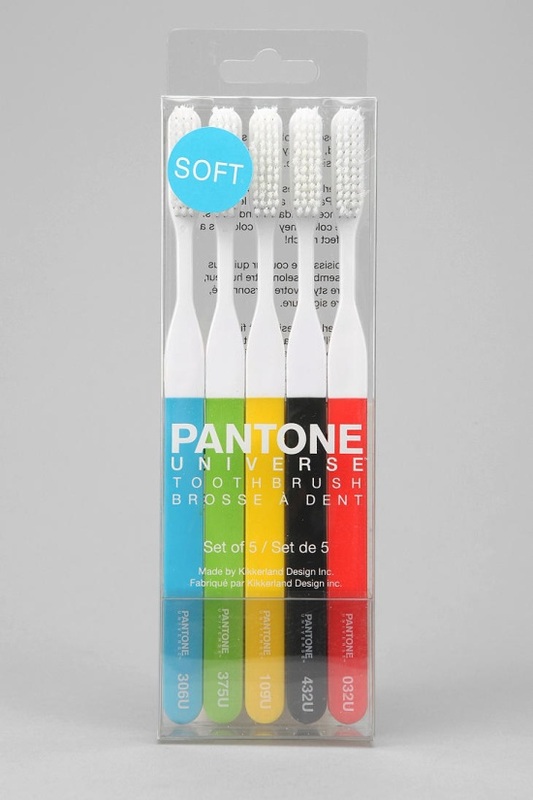
When you have Pantone toothbrushes, you know you've either hit the peak of your on trend lifestyle or you've gone crazy. These 5 colours seem to sum up the world as we know it, the colours are exactly the reason why everyone is crazy for Pantone and the packaging makes this whole experience 100 times better. Outside of the colours Pantone's brand is just simple black and white, with a plain font and a minimalist style throughout which, much like it does with these tooth brushes, brings the focus back to the colours. the plain plastic allows you to clearly see everything on the inside of the packaging and the plain white typography is set carefully do that it sits on top of the colours and not the white. The shape of the box is simple as is the layout of the typography. All together it looks spectacular.
 RSS Feed