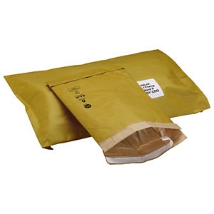
The bubbles in bubble envelopes are the main features that identify this type of packaging from other packaging solutions in the market. Bubble envelopes have not always been around and they were preceded by other models of padded envelopes. At first, during the pioneer years of mail and mail delivery, people would wrap items to be sent in mail with an assortment of materials such as cloth, papers, or anything that would offer some cushioning. These were bulky and would be cumbersome to send over long distances. They subsequently would attract high postage costs.
In later years after the invention of the envelopes, a company known as jiffy designed an envelope that had wood wool cushioning and this was the first true padded envelope. The product was very popular and was used for several years. Jiffy was later taken over by another company called Sealed Air. Sealed Air is the company that came up with bubble wraps. Sealed Air changed from producing padded envelopes with wood wool and instead started using the bubble wraps. This new design quickly became the preferred design. This envelope was preferred since it attracted less postage costs. This is because the cushioning was now made of air which has negligible weight as compared to wood wool. Also the bubble envelopes are less bulky and occupy less space. The materials used are also easier to get. Wood wool comes from wood and hence is not very eco friendly. Air is abundant and is recyclable.
Image from Pinterest
Bubble envelopes are of different kinds and different envelopes may have different sizes. Different bubble sizes will protect contents of the bubble envelope in different ways. For example, the large bubbles are usually used to cover space which is essential in packaging so as to restrain contents from moving around in their packaging. When items move around, they are likely to get damaged. Smaller bubbles will offer great protection from external compression forces, vibration forces and shock forces. This can be particularly destructive but they are well cushioned by the air bubbles.
Bubble envelopes can be made from home.
All one needs to have are the normal envelopes, (of whichever size), adhesive, scissors, and adequate sheets of bubble wrap. One will then cut the bubble wrap into dimensions that will fit into the envelope to cover both of the interior sides. One then applies adhesive on the inside part of the bubble wrap and sticks it to the insides of the envelope to create a perfect homemade bubble envelope.
Food for many people is a great way to get noticed. Food is the way to consumers hearts whether in the product or in the packaging. A trend very popular at the moment is making
packaging for products that aren't food, look like food or look like they contain food.
Images from Pinterest
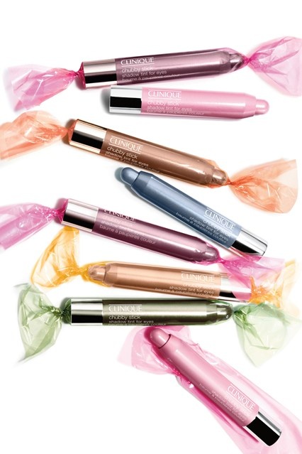
This style doesn't directly say that it is food related packaging however the style is the same as that found on some sweet and chocolate wrappers. Especially the colourful kind found in tins. The idea behind this is to show a lighthearted sense of colour and also make them seem even more desirable - as they are a beauty product they are intended to show it can make a woman look appetising.
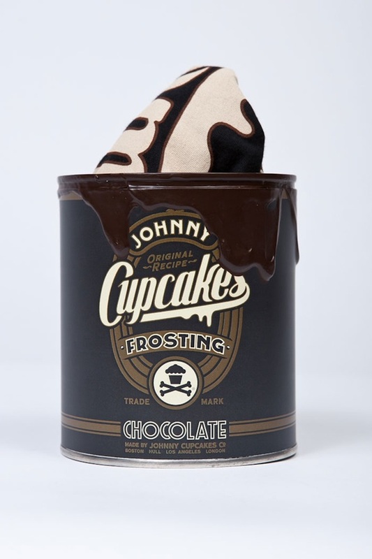
Johnny cupcakes is renowned for its imaginative packaging and the most popular is to do with food. The selling point for Johnny cupcakes is the fact that despite their brand name, they actually sell t-shirts, clothing and accessories. The frosting can, with fake frosting even dripped down the sides this looks like a highly realistic piece of food packaging. It even has 'nutritional values' on the back of the tin. These packaging designs make the clothing special as they are individual and something not seen before.
Whether it's food,
gadgets or household items, if the packaging is right it can make us happy as can be. Why is this? What is it in this disposable outer shell that we love so much when it is what's inside that truly attracts us?
Images from Pinterest
Often, particularly when it comes to buying food, when the price difference is little the final product selection comes down to the packaging. The better suited the colouring and style is to your tastes the more likely you are to purchase the product and with particular products come certain target markets and these markets may have specific feelings about certain designs and colours so can be more easily targeted is the packaging is gotten right.
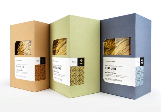
For example, this pasta packaging is aimed at a sophisticated target market as it is a premium product that requires prior knowledge of what to cook with it as well as how to cook it, suggesting that the consumer purchasing this may have some experience in the field of
luxury home cooking. This is reflected in its packaging. The simple earthy colours are quite basic, meaning to reflect the basic element of a meal these ingredients would make up. The quality of the colour and box however is far higher that the ordinary basic product. Because of its luxurious target market this packaging design has been designed to keep up with the trends in colour and pattern, as its label shows. The pattens reflect the beautiful typography that has been chosen and the whole ensemble shouts luxury product.
Sometimes in life, we all need a little bit of awesome, whether it's the packaging or the product its self. I think it is important that we
feed our brains with something interesting and awesome every now and again.
Images from Pinterest
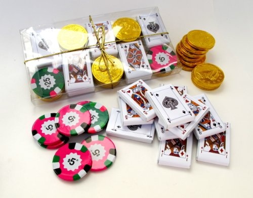
This is a whole new take on the chocolate coin. If you love to play poker then you'll love this. Chocolate packaged up as playing cards, coins and poker chips. The bright and colourful chips are very cool, betting chips are often a cool trinket that people like to collect and chocolate ones are even cooler. The playing cards too are fantastic, this package is a gambling chocoholics dream!
It really is difficult to understand both the packaging and the product here.
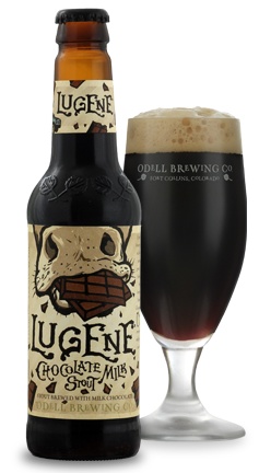
Chocolate milk is a highly enjoyable substance we all liked to indulge in as a child and beer is something us adults enjoy too. Put them all in the same product and what you have is awesome, mixed with something a little revolting... The packaging does a great job of getting the ingredients across before the consumer has even read the writing. The bottle is a classic beer bottle shape with the brewery logo embossed in glass on the side. The majority of the imagery is a cow eating a bar of chocolate which says all it needs to say. The typography is very Willy Wonka/Alice in Wonderland in style which reflects the weird nature of the flavour.
In the eyes of the ‘
luxury consumer’ packaging plays an essential role in the purchasing process. How would you react if you went to buy the latest perfume or a new MacBook Pro and they came packaged in newspaper and a carrier bag? Even though the product is the same, the majority, if not all consumers would not be happy or appreciate this. Buying luxury items is all about the experience, and this includes the packaging too.
Just because something is branded with being ‘luxury’ doesn’t mean it has to be majorly expensive or over excessive. Some great examples of this can be seen in high end jewelry packaging and Apple. They use minimal packaging but overall still scream out that it is a luxury item.
Images from Pinterest
When it comes down to your business and your packaging, creativeness and innovation need to shine through, think different. Keeping it simple and engaging the customer is key. Giving the customer that overall experience, and making them feel engaged with the product is essential. This can be from the unwrapping of the paper to opening the origami style packaging inside.
Luxury can still be achieved even with a low budget. Recycled and up-cycled materials can still be used in packaging your products. Its the experience that makes the difference. The creative design and use of these materials will give your packaging a bespoke feel and engage your customer. Unfolding your purchase out of the box is all part of the experience and helps to add value. The overall key is to come up with the most effective and efficient way to engage your
potential customers. No matter what the product is that you are selling, give the customer an experience and make sure you match up.
 RSS Feed