People these days are getting more and more health conscious when it comes to eating out. Alternatives to fast food are constantly being searched for and yet again the bigger industry giants like Subway are taking over as healthy alternatives. To try and combat this smaller stores have started to up their game when it comes to branding and packaging. Making themselves more memorable and promoting all the good things about them.
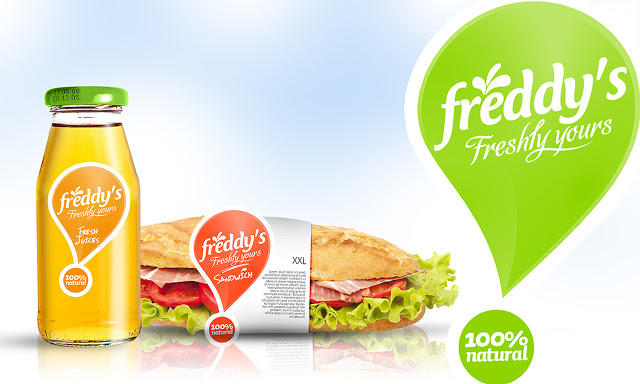
Image from packaging of the world
The use of an exclamation mark as the basis of the logo design gives some drama to the brand name and its tag line. The whole style of the design gives the feeling of freshness and natural ingredients (reinforced by the '100% natural' phrase used in the logo). The colour scheme appears very natural also, looking a lot like the kind of colour scheme you would find in a salad box, making the whole thing seem even healthier. The small glass bottles are also more easily reused and as they are heavier and more poignant - people are far likely to recycle them too.
 RSS Feed