When it comes to packaging, bright colours are thought to stand out from the crowd and grab a potential customers attention. That idea is in some cases quite effective however with so many brands hitting the distinctive colour mark it's difficult to stand out from the sea of colour and pattern we see on our shelves. When a brand gets it right however it really shows, a classic example would be the icon Cadburys purple which is a global leader in the world of chocolate packaging design.
Images from Pinterest
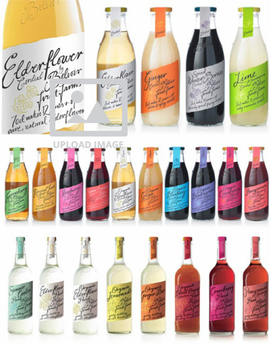
Belvoir Fruit Farms range of cordials and pressés have got their colours spot on. Not only does their labeling have a vivid range of colours which all somehow seem to match as a range, the clear glass bottles also allow the product colour to stand out and contribute to the bright feeling from the packaging. It is not only the colour of their packaging that Belvoir have got right however, the glass bottle style is quite traditional reflecting the high quality product and the typography is spot on giving it a handmade feel.
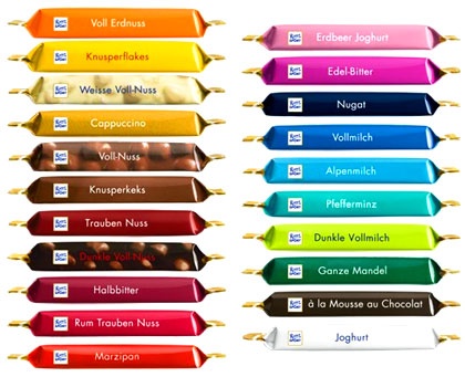
Ritter Sport Chocolate Bars have also hit the nail on the head, the German brand has become increasingly popular in today's snack market, one of their biggest selling points is that they have at least one of each flavour in a pack meaning that a customer can not only try all of the flavours but also the clear outer cellophane shows the full range of colour and patten inside.
 RSS Feed