Packaging never fails to give me something to smile about and the Valentines packaging is superb. There is something special about valentines day, If you get rid of all the disgruntled men and tacky gifts and focus on some of the better things. It isn't half bad for an over commercialised pointless day if you take everything with a pinch of salt and enjoy it for what it is. One of the best parts of commercial valentines day is the packaging.
Images from Pinterest
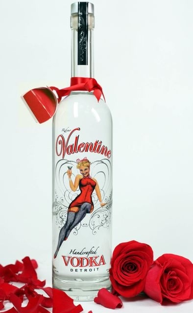
Valentines vodka, whoever said that valentines didn't inspire some of the best products. The red theme, swirly typography and simple bottle says valentines all over it without being stereotypical and tacky. The vintage style of the drawing says a lot about the product, that it is refined and stylish with its roots in the past.
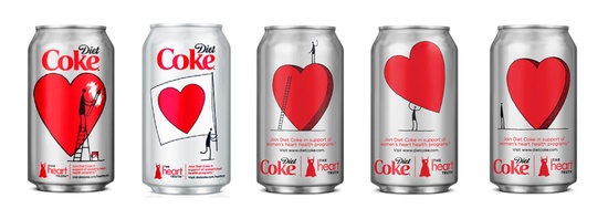
Coca-cola have teamed up with Diane von Furstenberg to create some really cute valentines day packaging for the popular fizzy drink. The diet version of the drink has been chosen partly because of the colours but also because it is a very feminine design and women are far more likely to drink diet coke than ordinary coke. The design is obviously themed for the day of love, the red love heart is visible from a distance only adding to the persona of theis iconic design.
 RSS Feed