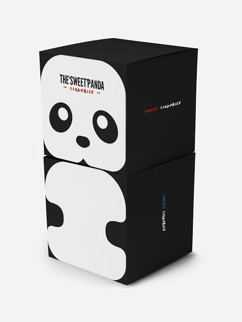
Packaging with animals on is usually found on products for children, with the exception of a few great designs including the frosted flakes tiger. The idea behind Panda's liquorice is that is appeals to both children and adults and despite the animal design it hits that purpose well.
Images from Packaging of the world
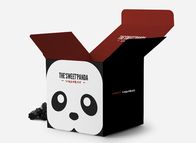
The brand Panda is well know for its sweet and salty liquorice and as a sweet treat designed to appeal to all ages they wanted to create memorable packaging that could be enjoyed by all ages. The use of the panda is an obvious symbol of the brand as a whole and the oriental style boxes and typography make it seem modern and on trend. The design also allows the boxes to be stacked to create a panda as they have both the head and body on the box. This will appeal to consumers of younger ages as they will be able to complete the panda themselves giving the packaging an interactive element. The simple black and white design of the packaging will also appeal to adults as although it is an animal image it is quite simple and doesn't look childish at all.
The insides of the box packaging are just as well themed as the outside, both salty and sweet have different colour themes, the blue of the salt will already be associated with the common crisp packaging flavour. Both the blue and red are attractive colours and are not gender specific and so can appeal to all consumers. They both go very well with the black and the simple box design makes it easy for consumers to eat and store their liquorice.


 RSS Feed