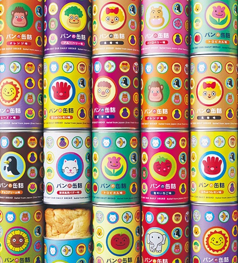
Whether it's food, gadgets or household items, if the packaging is right it can make us happy as can be. Why is this? What is it in this disposable outer shell that we love so much when it is what's inside that truly attracts us?
Images from Pinterest
Often, particularly when it comes to buying food, when the price difference is little the final product selection comes down to the packaging. The better suited the colouring and style is to your tastes the more likely you are to purchase the product and with particular products come certain target markets and these markets may have specific feelings about certain designs and colours so can be more easily targeted is the packaging is gotten right.
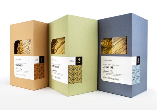
For example, this pasta packaging is aimed at a sophisticated target market as it is a premium product that requires prior knowledge of what to cook with it as well as how to cook it, suggesting that the consumer purchasing this may have some experience in the field of luxury home cooking. This is reflected in its packaging. The simple earthy colours are quite basic, meaning to reflect the basic element of a meal these ingredients would make up. The quality of the colour and box however is far higher that the ordinary basic product. Because of its luxurious target market this packaging design has been designed to keep up with the trends in colour and pattern, as its label shows. The pattens reflect the beautiful typography that has been chosen and the whole ensemble shouts luxury product.
 RSS Feed