The crisp packet is an everyday item. Children take them to school in lunch boxes, adults take them to or purchase them at work, they're used at parties, evenings in and for a quick source of food on the go. They have become so 'everyday' that people rarely even look at the packaging anymore. Across the board certain colours have been associated with different flavours, blue is salt and vinegar, red is ready salted and green is cheese and onion to name just a few. In all this mass purchase and consumption, it is the gourmet crisp that has risen to power. With fancy names an promises of environmental protection and less fat, expensive crisps have grabbed the consumers attention and their main method for doing this is packaging.
Source: Pinterest
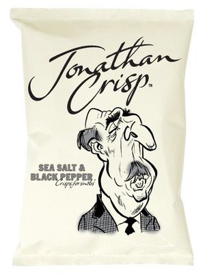
The first noticeable difference between this and your ordinary crisp packet is the lack of colour. Without this automatic colour-flavour association the consumer is forced to read the packaging (where the fancy name attracts them to this higher quality product). The second noticeable difference is the distinct lack of crisp related imagery upon the packaging. Usually your average packet will have an image of the crisp, or of potatoes or something related to the flavour. This packaging has none of the above and instead has what appears to be a completely unrelated caricature. This gives the packaging and therefore the product a personality. All these things combined make this packaging seem a cut above the rest, it isn't until the ordinary is altered that we realise the importance of packaging.
 RSS Feed