Yet another incredible design studio, originally founded in Tokyo, Japan but now based in Denmark, Studio ARHOJ focus of illustration, branding, packaging and interior design.
All images sourced from Studio ARHOJ
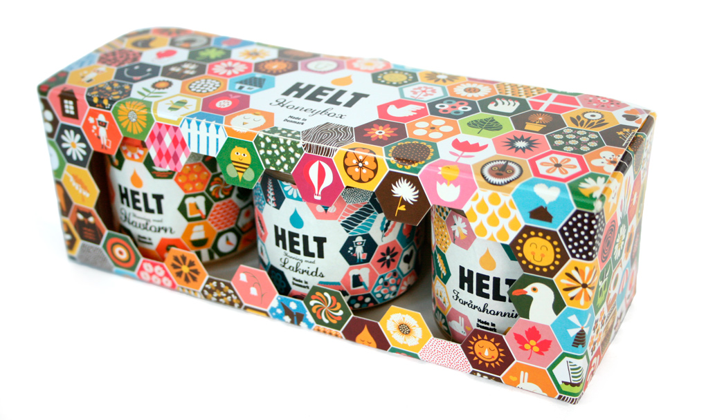
Studio ARHOJ have created this fantastic packaging for honey brand Helt. Using the basis of the multicoloured hexagons to create the entire brands packaging identity including boxes, labels and stickers. Each individual hexagon has a different image, all related to bee keeping, the production of honey or the outside world in general. They have used a fantastic range of bright colours along side their simple images for a really cute and personalised feel.
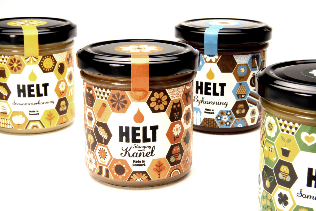
Helt have created 15 different flavours of their product and each flavour has been given a different colour scheme. The stickers that seal the lid to the jar form the basis of it and the hexagons are all colours within that little scheme. Because all of the labels have similar images with the same hexagonal layout, all of the products look like they belong in the same range. The typography used shows a strong impression of the brand, with each flavour written in hand written looking font for a more personal feel.
 RSS Feed