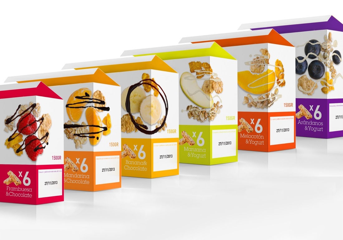
With an ingenious name like ñack, these healthy breakfast style bars are bound to have some excellent packaging designs and they don't disappoint. The name comes from a combination of ñam (meaning yummy in spanish) and snack to create ñack. The brand wanted to create something that would be yummy in taste and in design so used high quality photography of their products ingredients to create something that would be attractive to the consumer.
Images from packaging of the world
Each flavour has a corresponding colour directly relating to the ingredients giving it excellent colour to product association. Most cereal bars have the classic chocolate or yoghurt drizzle on top and rather than just showing the bars in their completed form they have shown high quality images of the ingredients decorated with the classic drizzle too. The ingredients themselves look far more delicious in their natural form and the notion that these ingredients will be included in the product attracts the consumer further. The base colour of the packaging range is white and this gives everything a fresh and clean feeling perfect when involving food products.
 RSS Feed