Pereg is a natural gourmet food company selling high quality spices, ingredients and other small snacks. The packaging redesign across all of their products has been orchestrated by Squat Design, a graphic design company who have worked on packaging design, graphics, animation, marketing, web design and stationary.
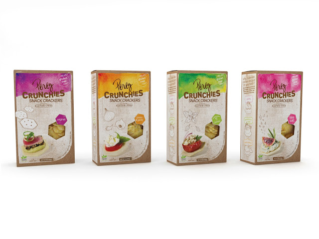
Image from packaging of the world
These snack crackers are not marketed or designed to join the crowded snack/crisp market. Instead they have been geared towards the creation of other foods. Whether that be appetisers or lunch food. The basic packaging is quite simple with an easy to use, open and re-seal box with an interior bag. The window in the packaging is the same shape as the product giving the consumer an idea of what to expect. The hand drawn images of the ingredients and the high quality images of 'serving suggestions' gives an impression of a high quality luxury product.
Images from Squat Design
The packaging redesign has incorporated Pereg's new logo/typography. The hand written element reinforces the 'family run' company feel and give the consumer more trust in the brand as a whole. The excellent colour, flavour and style association on the front of the packaging also suggests that the company knows what they are doing when it comes to their products giving the consumer further trust in the brand.
 RSS Feed