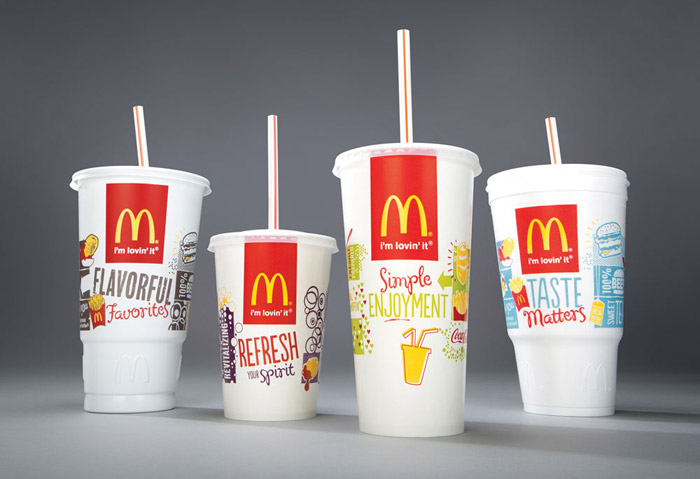
As one of the biggest and most recognised fast food chains in the world McDonald's has to be on top of it's branding, marketing and packaging. To get left behind in the world of packaging design means not keeping the brand modern and fresh and that is a slippery slope to failure. The iconic red and gold designs are being kept on their burger and fries packaging but their 'take out' packaging, which will have the most publicity due to it being everywhere, has been changed to reflect a better brand image.
Images from the die line
McDonald's amongst other fast food chains are notorious for putting ingredients in their products that consumers didn't expect or want but since public outrage and pushing from the government for healthy eating McDonald's have been forced to clean up their act. Their new packaging is focused around giving the consumer more information without filling it with a huge amount of text. Instead they have incorporated QR codes so that the reader can find out more information if they wish too.
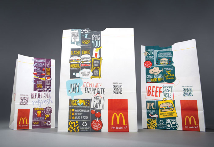
The new design has a fresher feel about it, using white on the paper takeout bags rather than brown makes it seem cleaner and highlights the McDonald's logo. The style of decoration, images and typography now covering the packaging has been updates to look on trend with some interesting facts as well as some cool illustration. On the whole the new McDonald's packaging looks fresh and fun but will they be able to survive in a world where everyone is trying to be fitter and healthier. Probably.
 RSS Feed