Sometimes marketers get it wrong; they over design their packaging with too many offers, too many star bursts, too much text and a huge range of colours. It can be overbearing on the consumer, and it can blend into the heaving shelves of similar products all trying to catch your attention with the same methods.
So what happens when we strip back packaging design to it's bare minimum and keep only the necessities? Does it help or hinder the brand? Or does it show packaging designers the very point they should stop if we strip back one element at a time?
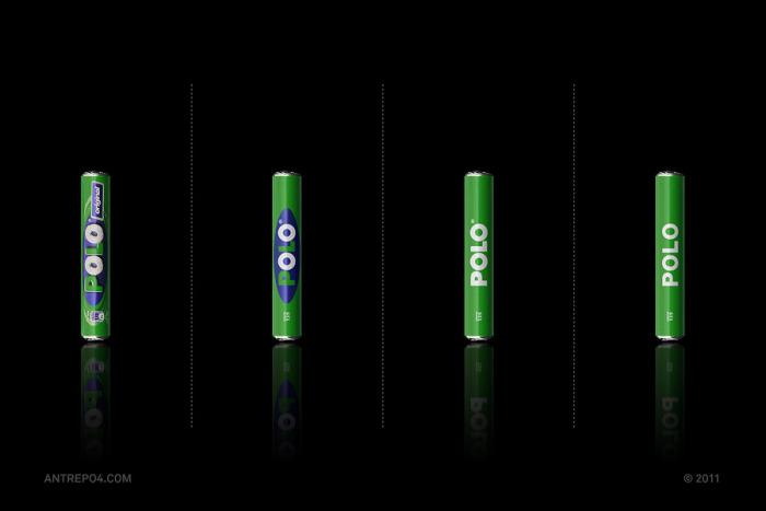
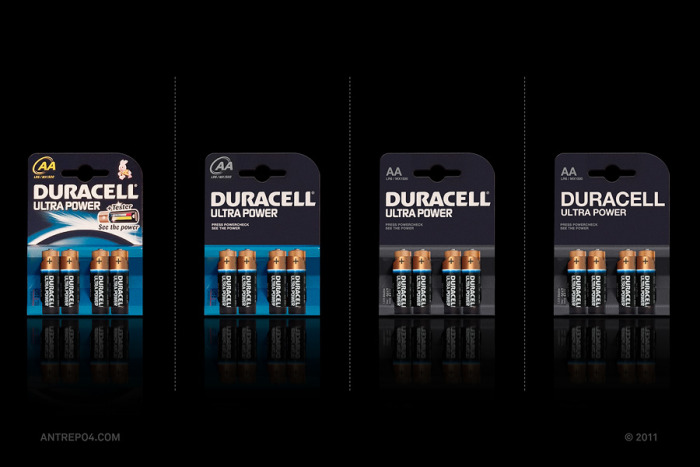
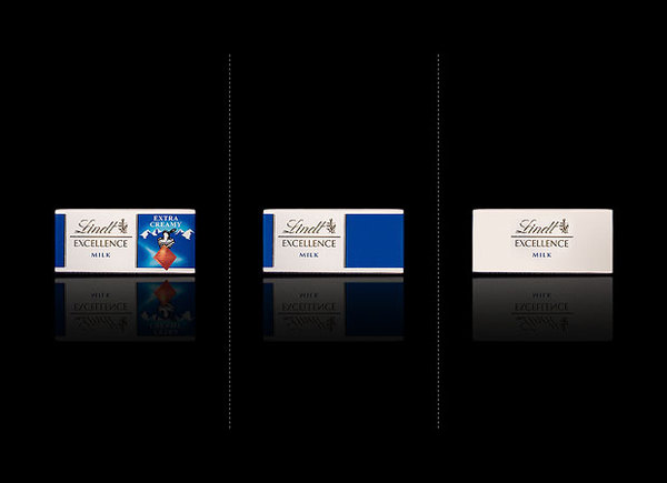
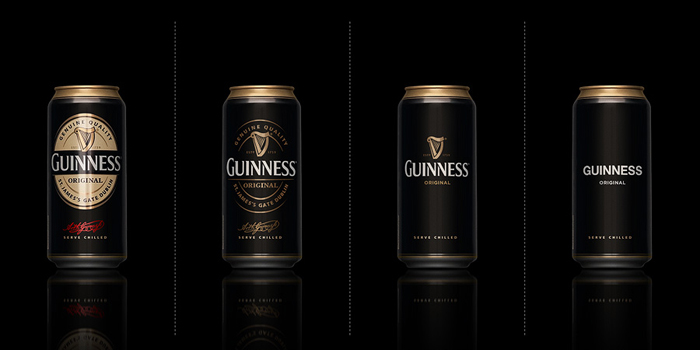
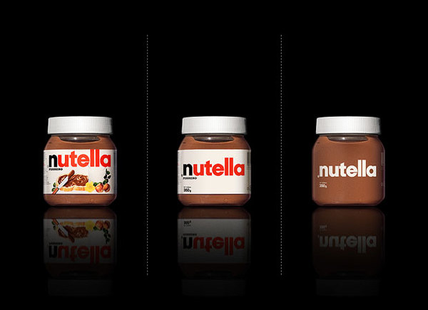
Design collective Antrepo decided to conduct a study in brand minimalism, they simplified the packaging of major brands we know and recognize, and here are the results.
So what happens when we strip back packaging design to it's bare minimum and keep only the necessities? Does it help or hinder the brand? Or does it show packaging designers the very point they should stop if we strip back one element at a time?
Design collective Antrepo decided to conduct a study in brand minimalism, they simplified the packaging of major brands we know and recognize, and here are the results.
 RSS Feed