Sometimes there are many words to describe packaging that finds its way into the universe and other times there is only one. Packaging is a versatile field, having packaging trends doesn't necessarily mean that people will follow them.
Images from Buzz Feed
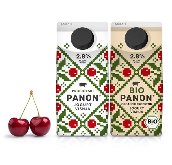
This foreign yoghurt brand has adopted a pattern similar to cross stitch which is neither current nor trendy and yet the packaging its self looks very modern and up to date. It is clear that the key ingredient is cherries but the font looks strangely like something from IKEA as it is quite simple and is very easy to read.
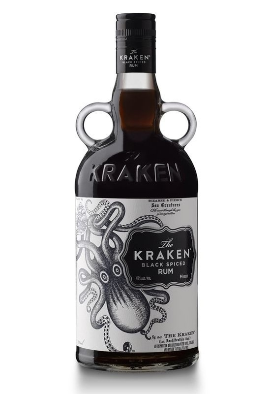
This packaging is highly unusual. Firstly the shape of the bottle is quite unlike any other alcohol bottles seen before, the double handles suggests that it is quite heavy and needs support when pouring. The feel of the packaging is quite dark, reflecting the colour of the product. The glass is imprinted with the name of the product which also happens to be a dark mythical creature the Kraken, making the packaging more menacing. The pen and ink drawing and writing on the label adds to the old fashioned and dark feel of the overall product.
 RSS Feed