Hatch design are always working hard on something and this time it's something quite special. In the past, people often associate fast food chains with greasy, sub-quality food that does more harm than good to people and the environment. Over the last couple of years many fast food chains have battled against this stereotype. McDonald's for example slashed the amount of calories in its food products. One of the biggest things to change amongst fast food chains worldwide is the packaging.
Images from Pinterest
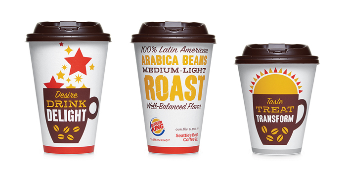
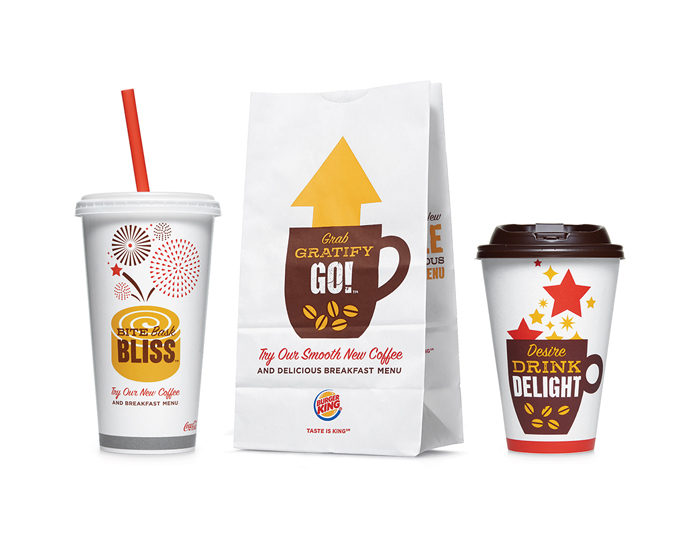
Burger King are determined to break the 'bad food' label and have started to do so by forming a relationship with 'Seattle's Best Coffee'. By bringing in quality coffee they are raising the standard of the products but this alone isn't good enough. Along with Hatch Design they have created some attractive coffee cup and takeout packaging designs. The plain white with a warm colour scheme looks positive and inviting. Their use of typography also gives an element of trend and style that is starting to show more and more in fast food packaging as they are beginning to keep up with the times. Keeping the brand logo to a minimum and making the decoration the focus means that unless you have bought from Burger King or look very closely, it isn't instantly recognisable. This makes it a product of interest and makes the consumer more likely to go and check out what's new.
 RSS Feed