Packaging should appeal directly to the consumer and give them the impression that they need that product in their lives. Usually this is done in similar ways across the competition in certain sectors. For example the packaging for women's face cream often shows a flawless female face as this is what the target consumer wishes to achieve. Milk packaging often shows images of cows, grass, flowers or the UK. This is because they want to show that the milk has been produced by cows that are in a pleasant environment and that it is supporting local cow farmers. By this concept then, cookie and biscuit packaging should have delicious images of the ingredients they contain or of an example of the product its self. For the most part this is correct however for früute cookies this isn't the case.
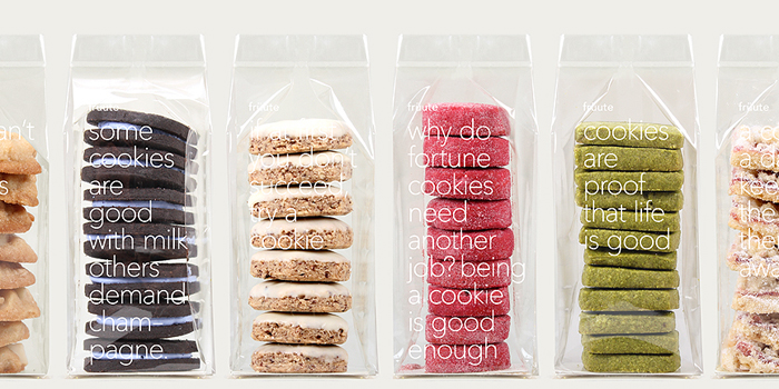
Image from the die line
Clear re-sealable bags containing a simple stack of cookies, although it shouldn't seem so odd, goes against so many of the norms for packaging. The see through element allows the consumer to see the product inside which is a common element in packaging however it doesn't usually make up the entirety of the packaging. The use of simple typography and positive phrases gives a simple persona to the product, giving the feeling that the product is far more personal. Simple packaging design like this is very effective yet rarely used, perhaps because it shows the product, which requires honesty and a good looking product, these cookies however tick both these boxes. A brilliant example of packaging design by Ferroconcrete.
 RSS Feed