An American brand design company that focus on bringing meaning to a brands identity through the use of marketing and packaging. Their packaging tries to take into account the brands history and it's place in today's market. Understanding the consumers interaction with packaging and a products brand is incredibly important.
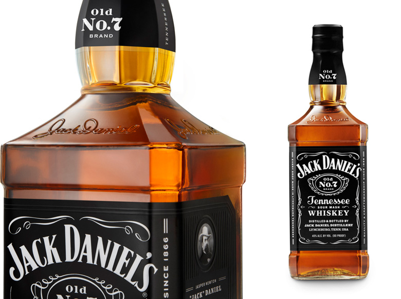
Jack Daniel's packaging has become somewhat of a cultural icon. The black and white logo can be found on t-shirts, jumpers and posters everywhere and it is a particular favourite for editing with people personal text. When consumers can relate to a products packaging so much that they want to use it in their everyday lives, you know you're doing something right. Cue handled the updating of JD's bottle shape very well, keeping its masculine shape and signature neck as well as polishing up the label to a new high standard.
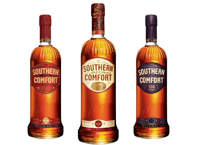
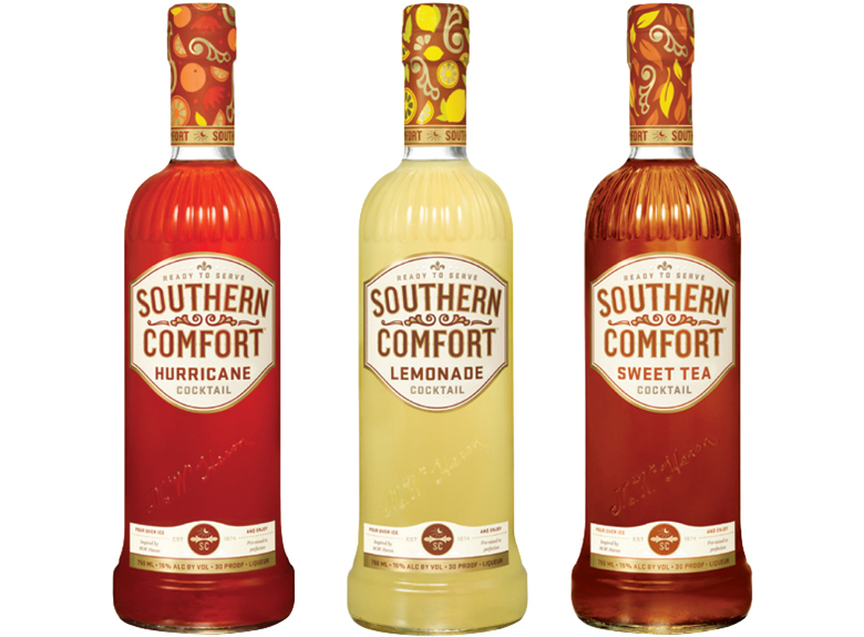
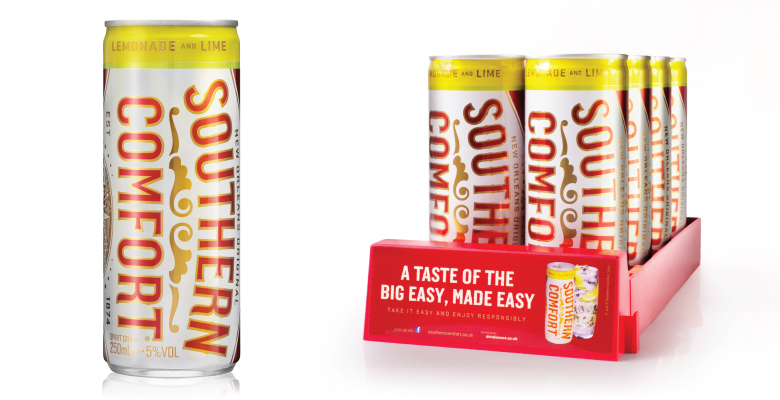
Southern Comfort wanted to extend their brands product line. Introducing pre-mixed cans, cocktails and two new flavours (Tabasco pepper and black cherry). The introduction of a new product is always risky as it can risk diluting the integrity of the brand however Southern Comforts packaging has remained in immaculate and thanks to Cue looks better than ever.
 RSS Feed