Orla Kiely is a fantastic designer who has created clothing, handbags and all manner of decorated household items. Somehow however it is always her packaging design that I find most refreshing. Especially when she teams up with environmentally friendly cleaning product company
Method. This is the second time they have produced wonderful packaging design together and their work only ever seems to get better!
Images from The Die Line
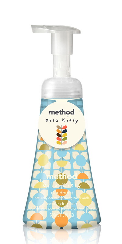
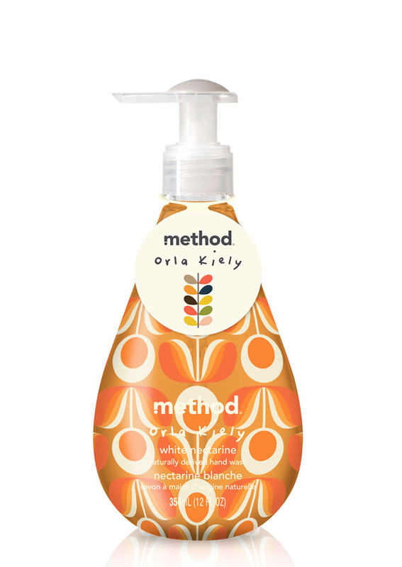
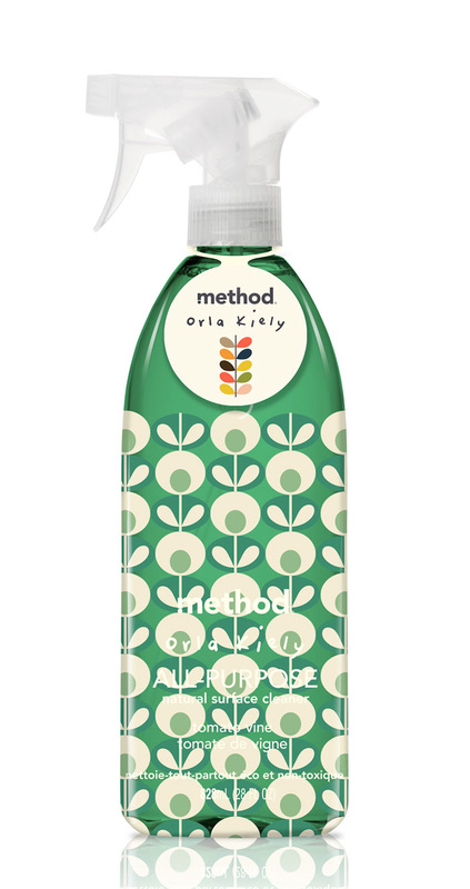
The 'Method' element to the packaging is what gives it the wonderful shape. All of the packaging is designed to have a flattering and attractive shape, quite unlike most other cleaning products and hand washes around today. This attractive shape also makes it nice to use as well as nice to look at and increasing consumer satisfaction is always a surefire way to gain returning sales.
The different mix of patterns and colours matches the scent of the product which gives a coherent feel to the entire range. The classic Orla Kiely designs also seem to reflect the uniqueness of the brand altogether and give them both an elevated status in terms of product and design.
The label that is featured on all products across the range has the iconic
Orla Kiely typography and design upon it to leave the consumer in no doubt as to who the designs were created by. The designs themselves have a beautiful tone to them that are entirely different to the usual range of colours used in cleaning and household products.
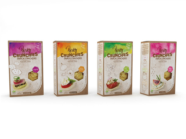
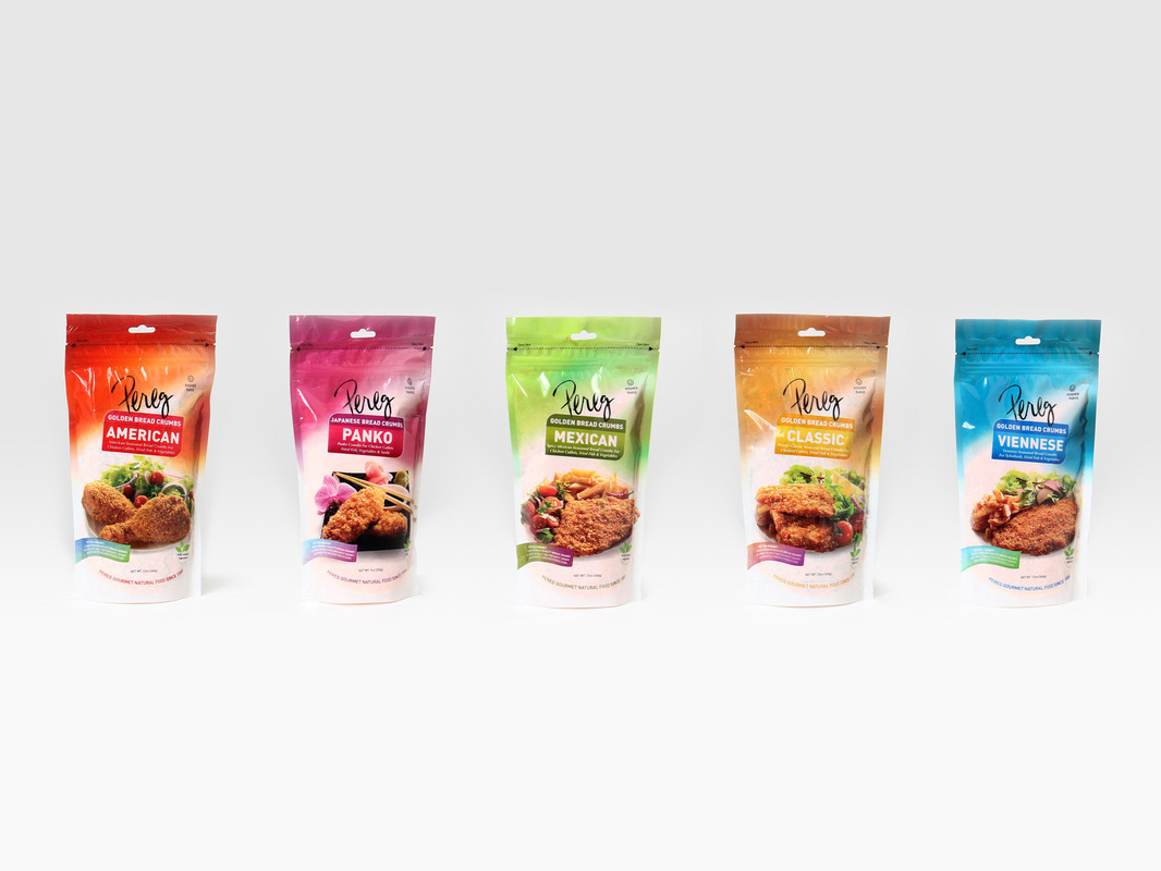
Pereg is a natural gourmet food company selling high quality spices, ingredients and other small snacks. The packaging redesign across all of their products has been orchestrated by
Squat Design, a graphic design company who have worked on packaging design, graphics, animation, marketing, web design and stationary.
Image from packaging of the world
These snack crackers are not marketed or designed to join the crowded snack/crisp market. Instead they have been geared towards the creation of other foods. Whether that be appetisers or lunch food. The basic packaging is quite simple with an easy to use, open and re-seal box with an interior bag. The window in the packaging is the same shape as the product giving the consumer an idea of what to expect. The hand drawn images of the ingredients and the high quality images of 'serving suggestions' gives an impression of a high quality luxury product.
Images from Squat Design
The packaging redesign has incorporated
Pereg's new logo/typography. The hand written element reinforces the 'family run' company feel and give the consumer more trust in the brand as a whole. The excellent colour, flavour and style association on the front of the packaging also suggests that the company knows what they are doing when it comes to their products giving the consumer further trust in the brand.
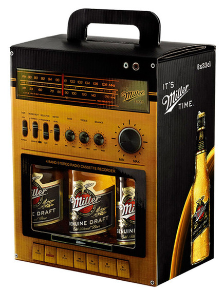
I am addicted to
alcohol packaging. Wines, beers, spirits and all manner of alcohol consumption and creation related products and their packaging make my world go round. Please let me know in the comments if I'm not alone. Here are some of my favourite alcohol packaging designs!
Images from - from up north
This beer packaging design is genius! The outer box is designed to look like an old fashioned tape player and radio, the detail of all the buttons, switches and even the screws is fantastic. The window that would usually reveal the cassette instead shows the iconic beer label and the slogan 'it's Miller time' fits in with the idea that drinking Miller is something to be done when relaxing and enjoying time with friends.
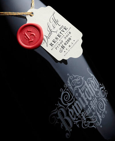
This Pinot Noir packaging has an element of spookiness about it. The font used that appears to be printed directly on to that glass is highly decorative and is reminiscent of something that could be found in very old books. The grey decoration on the dark glass also has a smokey effect and doesn't really jump out at the consumer making it harder to read. The label has the classic Alice in Wonderland 'drink me' idea on it and the product is made to seem of higher quality with a real wax seal.
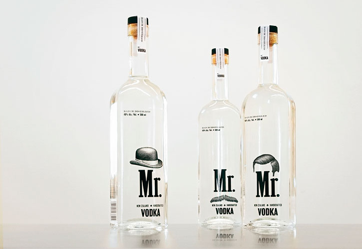
Well, yes. This New Zealand based
packaging company has their finger on the pulse in terms of packaging. They have produced some wonderful designs that make their clients products super competitive in their respective fields.
This vodka packaging brings a humorous side a the luxury brand. They have used the idea of the ideal gentlemen to create decoration for each different sized bottle. This is not only amusing as items such as mustaches and bowler hats have become popular culture but also gives the idea that vodka is a gentleman's drink.
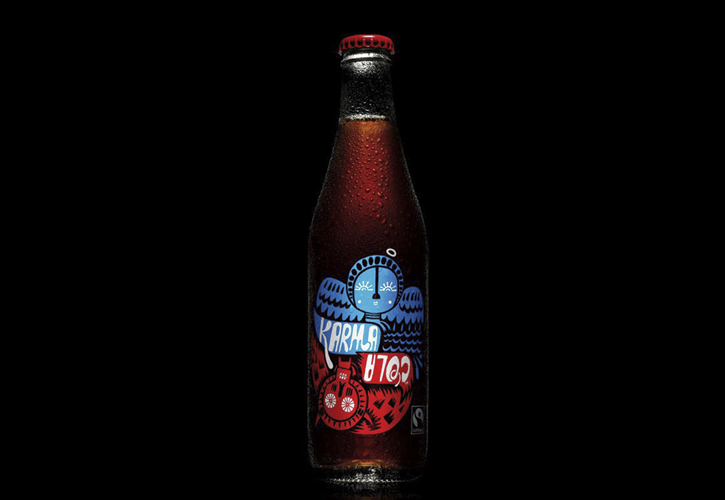
Another fantastic example of packaging design that communicates branding is
Karma Cola. All of the ingredients are sourced from fair-trade cooperating farms and companies, meaning that some of the profit is given to their sources to help the surrounding area prosper. The imagery on the packaging is simple, an earthy simple drawing of an angel and devil, linking to the brand philosophy. All of the packaging is simple and easily translates the brands purpose to the consumer. The bottle its self is simple and functional and is well designed to do its job without seeming flashy.
We are all so used to certain products being packaged in certain ways that when something is
packaged alternatively people notice immediately. Being ahead of the packaging trends (or setting them in effect) is the only way to get a consumers attention in the ongoing war of brands and products.
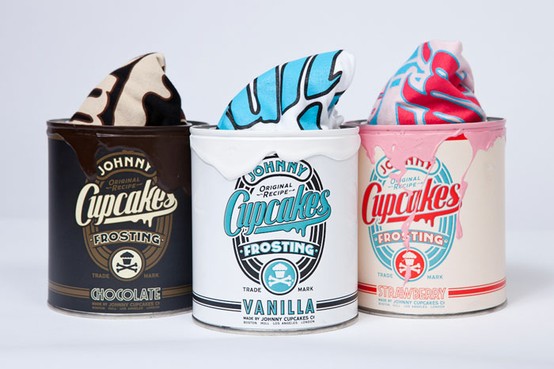
Johnny Cupcakes is, weirdly, a t-shirt brand. It's t-shirt packaging is not t-shirt packaging, it is 'frosting tins' and 'ice cream tubs'. Everything from the style and shape to the label and materials used to put this packaging together is exactly the same as those found on frosting tins and ice cream tubs. The originality when it comes to the packaging is one of the reasons these t-shirts are so sought after.
The weirdest element of this packaging is the fact that it was packaging originally designed for a different product. Usually packaging is created to hold a product in the most efficient way but now things are so competitive, the brief for producing new packaging designs has changed entirely.
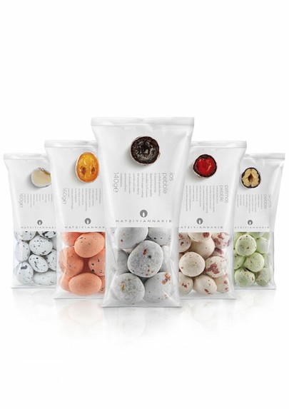
Trends in the world of packaging happen just as much as those in fashion and other sectors and one of my favourite trends is packaging that is very visual. Mostly full of images, textures and patterns.
The clear end of the packet shows the pebble looking fruit candy (the packaging world has seen weirder products believe me) with a clear image of what it looks like inside. Despite this packaging showing the actual product rather than images, the way the packaging is laid out makes it appear very visual.
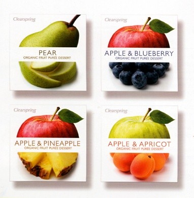
This packaging is very visual. The images of the fruits, some left untouched, some cut and photographed in an artistic fashion.
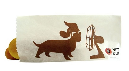
Despite only being a single colour image, it still makes up the majority of the packaging and inserts an element of humour.
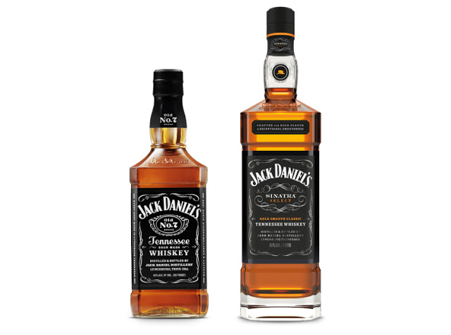
It seems the companies never tire of making limited edition versions of their products and along with the 'limited' name tag usually comes some fairly special packaging.
The above image shows an ordinary bottle of Jack Daniels in comparison with a limited edition 'Sinatra Select' bottle, in honour of
Frank Sinatra who was a big fan of the drink.
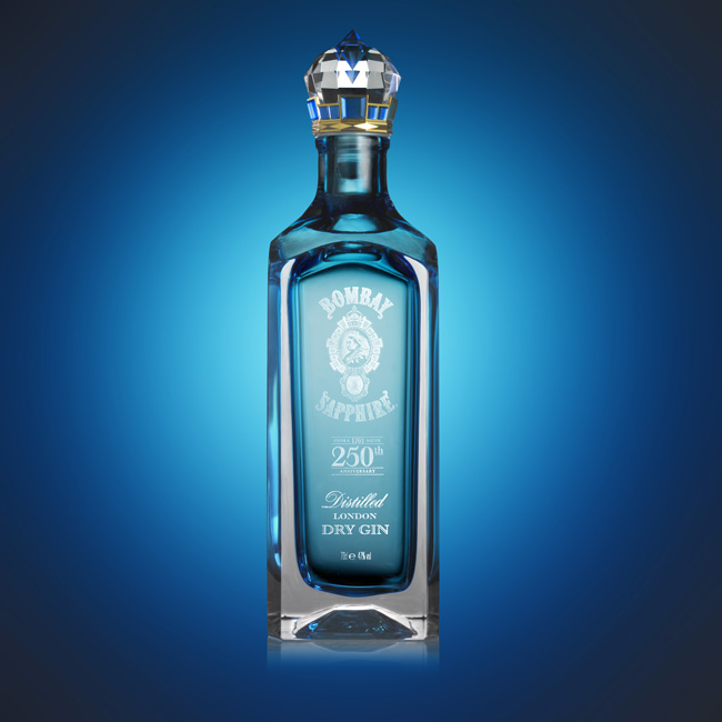
This limited edition bottle of
Bombay Sapphire is to celebrate their 250th anniversary. The stopper was specially designed by creative director Stephan Webster.
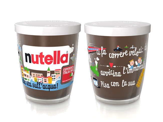
Limited edition Nutella jars that focus on the roots of the product - Italy. With Several different designs and good quality packaging, it is a highly desirable product for consumers.
 RSS Feed