These graphic designers based in Poland specialise in packaging design, branding and illustration.
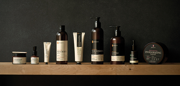
Their main love and focus is on product and packaging design. For this cosmetics company they used earthy clean colours and a nice elegant font to show the simplicity and quality in the products.
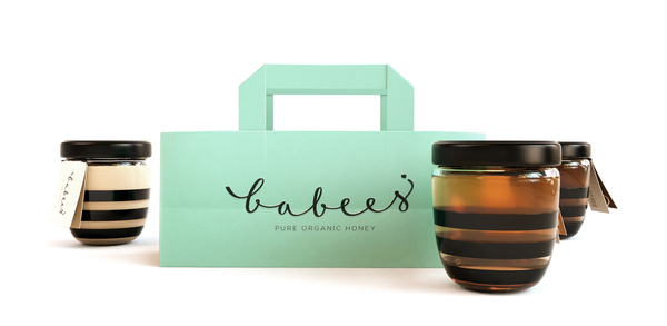
Clean and simple design is what they're all about, babees honey is great example of this, combining simple black and clear glass jars with the classic bee stripe and a bright coloured bag looks great as an ensemble. The clean little labels with the logo on also look great.
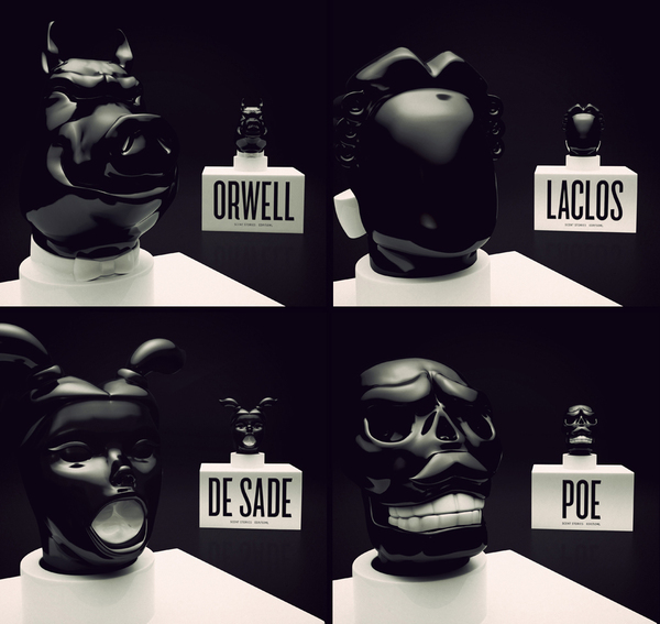
These men's fragrance bottles all have significant meanings behind them and have to cleverly crafted to represent the dark meanings behind some of the male genders literary greats.
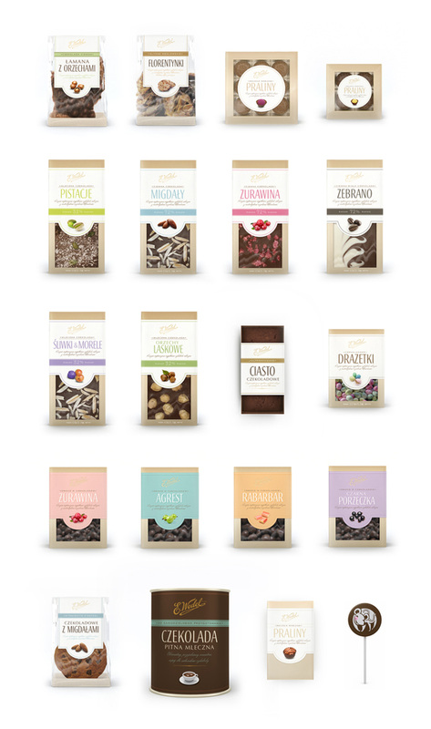
This packaging for a gourmet chocolate brand combines a slightly polished modern look with the classic chocolate package design. Clean fresh text, bright simple colours and detailed small images.
 RSS Feed